
Online marketing is becoming increasingly challenging as the days go by. For your brand to stand out in a big sea of big marketing fishes, you’ll need to ensure that your site offers the best possible user experience (UX). Give your visitors a pleasant feeling when they reach your platform, and they’ll stay. Give them a bad experience, and they’ll leave.
Website design and user experience are the two elements that complete each other. Eighty-eight percent of users are not likely to return to a website that provided them with bad user experience. The better and nicer your website design, the more it will please the eyes of the users, and the longer they’ll stay. More than that, your site visitor must be able to easily access and explore every page, image, and link.
Unfortunately, many web designers don’t even realize that the UX design practices they’re using are no longer effective or productive. So, let’s take a look at 10 abandoned UX design strategies that you might still be using. If you find out that your website’s UX design is outdated, fix it immediately!
1. Complex Interfaces with Multiple Features
Clogged websites no longer satisfy users. In fact, it annoys them up to the point that they bounce and look for something simpler. Simplicity in design is now the most powerful practice for offering the perfect user experience.
There’s absolutely no user who will enjoy getting lost in the complexity of your website. Therefore, providing visual clarity and presenting only a few choices at a time is essential for preserving your prospect’s attention and interest. Nowadays, simplicity is the key to great UX design.
2. Too Bright and Too Numerous Designs
Your website has poor design when the colors and the effects it features are too bright and numerous. Here’s an example of a messy design that could have been improved by now:

As you can see, the black background and multiple colored elements make the website visually heavy. The structure is messy and far from being user-friendly.
3. Intrusive Pop-Up Welcome Messages
If your website pops up immediate welcome messages that are both intrusive and annoying, your users’ experience will be much affected. To avoid annoying your users, make sure the welcome messages don’t pop up immediately after they land on your site and don’t pop up too frequently while they browse. Also, make sure the welcome message has an exit option so users can exit out of the welcome message.
4. Sticky Navigation Menu Bars
The navigation menu is the first thing that pops up in your website visitors’ mind whenever they want to dig deeper. Ideally, your site’s navigation menu should respond to all their queries and requests and should be able to guide them to the information they are searching. If users have trouble finding something, they’ll leave and go somewhere else without a second thought.
Even though sticky navigation menus are supposed to help the users find information faster, sticky navigation menus can sometimes produce damages to your UX. Ensure your navigation menus don’t cross any borders, and seek feedback from your users to see whether they like the menus or not.
5. Over-Emphasis on Texts
Textual failures are represented by the number of mistakes that you might make when developing the content of your website. Whether the mistakes are found in your blog posts or in the text of your web pages, you need to ensure that you fix these aspects immediately.
During a recent talk with Jane Kinsey, an experienced design expert who works at EduGeeksClub, she described a significant change in UX that her company adopted in order to improve their website’s performance.
“Our writers were encouraged to use italics, bold, and underlining throughout most of the content pieces to highlight the essential points. After three months of intense analytics targeted towards the experience of our website users, we understood that our practice was, in fact, counterproductive, leading to a big bounce rate. The moment we stopped using all the options and focused on clear structuring only, our performance changed for the better.”
Thus, when designing the text on your website, make sure to abide by the following rules:
- Pay attention to unreadable typography. Ensure that everything is neat and clear.
- Eliminate lack of structure or bad structure. Pay close attention to your subheadings, bullet points, and other structural elements. Instead of writing blocks of text, separate your ideas to make them more digestible.
- Eliminate grammatical mistakes. Make sure your content doesn’t contain multiple grammar errors.
- Don’t overuse highlights, bold, and italics. As Kinsey illustrated, if you use these designs wisely, you’ll enhance the message of your texts.
- Make sure the alignment of your text is pleasing to the eye.
6. Frustrating Dead-End Pages
Another terrible UX design practice is dead-end pages. Although there are numerous types of dead ends, here are the common ones you should immediately take care of:
- “No results found” – Whenever your users search for keywords (through your search option) that your website doesn’t fit, the “No results found” error will appear. In this case, you should provide your users with suggestions such as “Did you mean…?” or “Related Searches” instead of leaving your visitors with no direction.
- Pages that lack a call to action (CTA) – If your users don’t know what to do next, that will be a dead end for them. That’s why you should include strong CTAs throughout both your blog and your page.
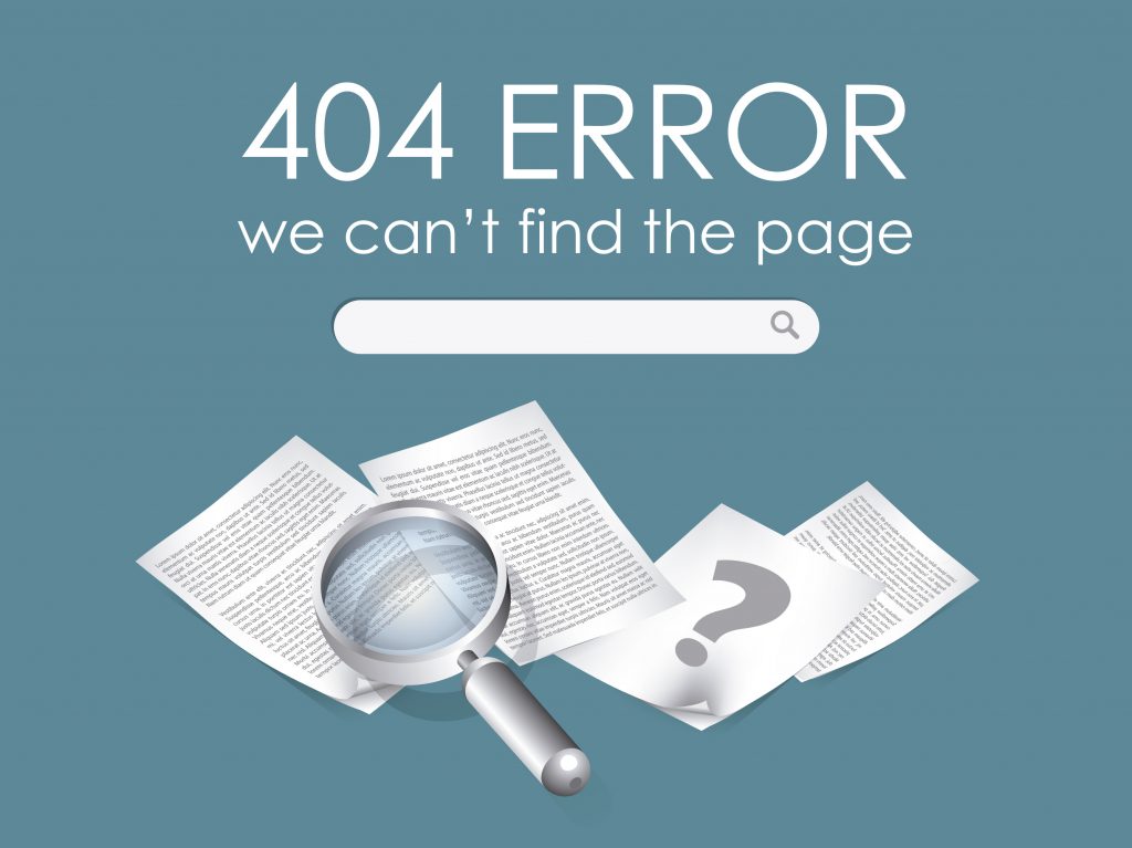
- 404 Error – This is the most common error that shows up as a result of a broken link. If your users encounter this error, it means you haven’t successfully updated your links and meta URLs. Fixing this problem is not complicated at all.
7. Dizzying Pagination
If your users have to click 10 times to get through a 10-tips post, you’re doing it wrong. This is an outdated strategy that used to work a few years ago when Google wasn’t that smart.
Websites started using dizzying paginations in order to influence their search rankings. Nowadays, this strategy no longer produces that kind of effect. Instead, it only manages to irritate the users and to encourage them to look for a better experience elsewhere.
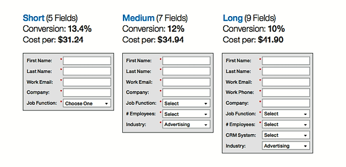
8. Inconvenient Forms
Unfortunately, most people today are always in a hurry. They’re rushing, so they can’t afford spending 10 minutes or more filling out the forms to place an order. Don’t displease your users by asking for too much information and invading their privacy. Here are the dos and don’ts of online forms.
- Don’t add too many questions. Do keep everything on point.
- Don’t make the reader type too much. Do give them multiple choice options.
- Do ensure that there are no bugs that will stop your users from proceeding.
- Do ensure that all captcha checks work properly.
9. Aggressive and Unexpected Ads
What makes visitors irritated are the slide-in ads or video ads that appear from nowhere, appear repeatedly, and interrupt the on-site session that they are having. The purpose of an ad is to draw the attention of the user. However, it can produce the opposite effect if it’s too intrusive or unrelated to the page theme. Find out the best time to use it by observing your users’ behavior through any website analytics tool and ensure your ads add value.
10. No Paddings for Navigation Bars
If your website’s menu bars have no paddings, your users won’t be able to access the link unless they click precisely on the text displayed. Such navigation bars are extremely inconvenient because your users will have a hard time accessing your website through mobile devices.
11. Irrelevant Deceptive Images
Images on your website that cause your customers to click a misleading headline or an irrelevant ad in the site’s header that will take them to an external resource is the worst UX design you can have right now. Indeed, visual content is necessary for a great user experience, but if that content is used as clickbait, aimed at generating revenue per click, it’ll only produce negative consequences such as damaged brand reputation and an increased bounce rate. So, whenever you decide to place advertising on your website, make sure it is of high quality and maintains the theme of your website or blog so as not to confuse your visitors.
Additionally, make certain that all the stock images you use look natural on your site or content. Don’t use pictures if they don’t enhance the message you want to send.
For your marketing campaigns to be effective, your UX design must also be professional; otherwise, you’ll spend money that’ll go to waste not because of bad marketing but because of bad “hosting.” Learn what your “guests” prefer the most and offer them that wonderful experience. Don’t do the same mistakes again, and keep optimizing the user experience until you’re satisfied.
Rachel Bartee is a content writer and a marketing consultant. She is content oriented and knows how to put words into action. She feels passionate about travelling and inspired by her morning yoga. Get in touch on Facebook and Twitter.