Even the most talented of artists experience a creative block from time to time. Take Shakespeare who, in Sonnet 86, blames a rival writer for his inability to write. Simply give Gwen Stefani’s song “What You Waiting For” a listen to feel her frustration over her inability to write a hit song.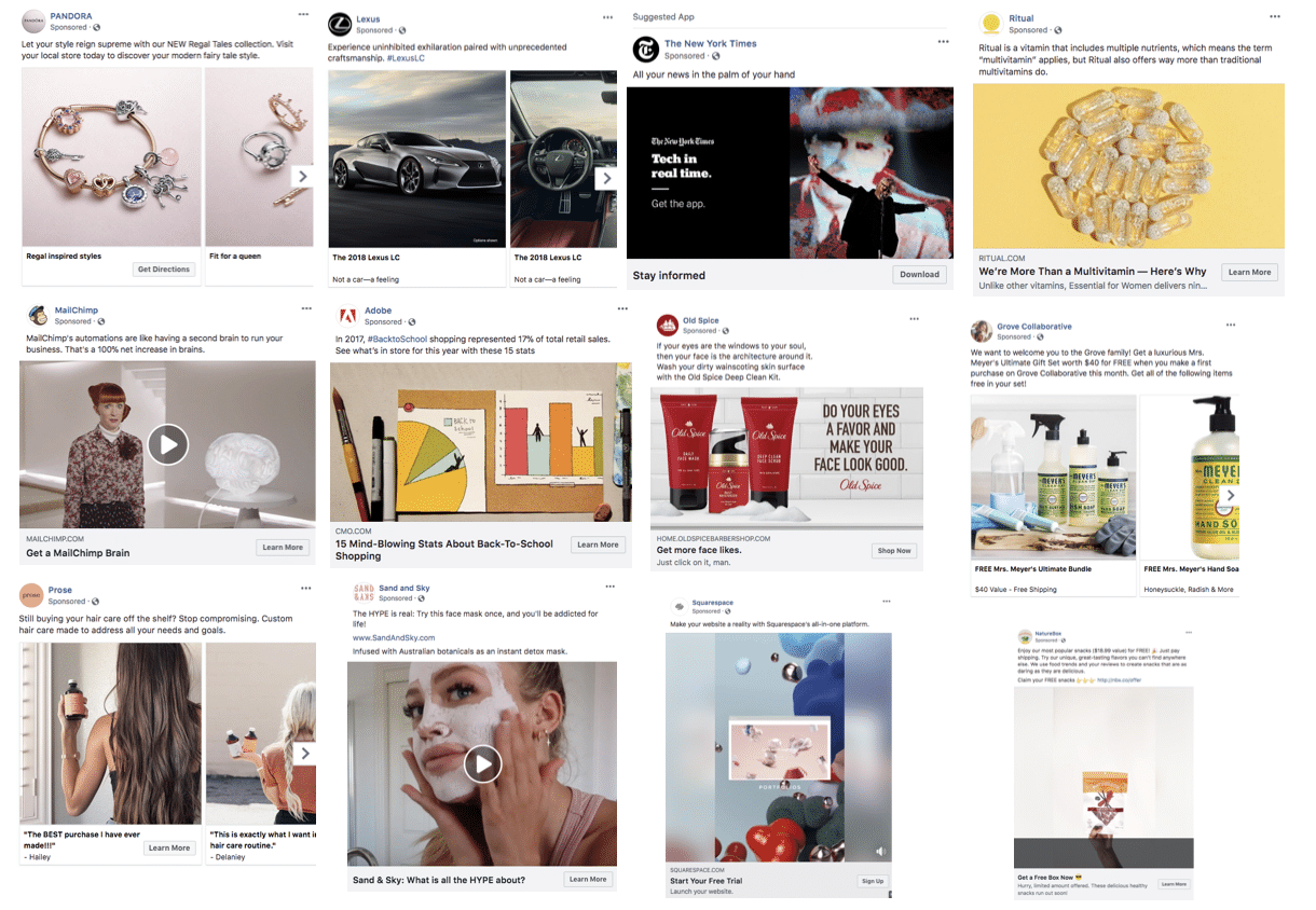
Creative block is a common occurrence, and you shouldn’t be ashamed of experiencing it when it comes to creating a compelling ads. You also shouldn’t be ashamed of finding inspiration from your favorite brands. Even the best Facebook advertising agency will do it. Here’s a list of 20 Facebook ads from which you can draw inspiration. Why should you emulate these ads? Because they are effective.
Table of Contents
1. Sugar Bear Hair
Sugar Bear Hair is a gummy vitamin that helps women grow thicker, healthier hair. This brand’s vibrant ad not only catches your eye but also employs an effective marketing strategy.
The text, instead of pushing for a hard sell, educates audiences about the product. The ad teaches them about the product’s ingredient, pectin, which is “made from fruits” and “gives the SugarBears the chew consistency with natural vegetarian ingredients.” By educating audiences about its product, the ad also simultaneously presents a benefit: the product is all natural and vegetarian.
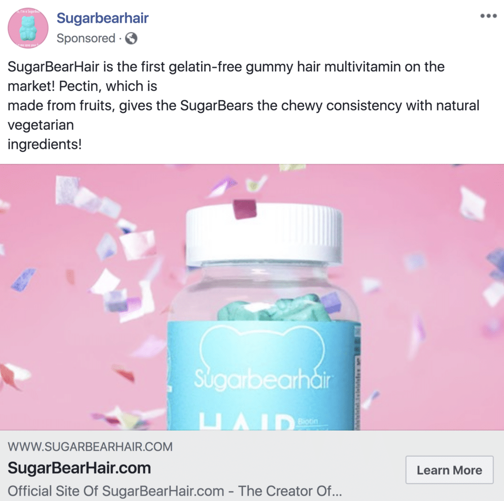
While teaching audiences about its product, the ad also incorporates branding in the image. Not only does the image feature the product and logo, but it also maintains a color scheme consistent with the brand’s: blue and pink. The colors are bright and eye-catching, popping from the cluttered News Feed.
2. Dollar Shave Club
This ad by Dollar Shave Club, a subscription service for razor users, tackles a relevant topic: women’s equality.
The ad evokes emotion by using the strong words and phrases “strike fear,” “hearts,” “bad guys,” and “change.” These words give the audience, especially the women in that audience, a sense of empowerment.
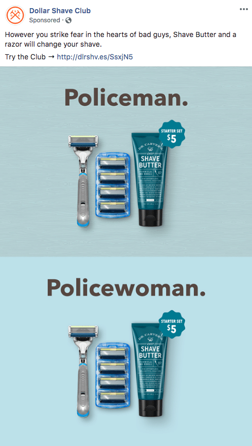
The sense of empowerment plays an important role in the ad’s image. The image address both the policeman and the policewoman and emphasizes the equality between men and women by including identical products with gender-neutral colors and prices under each word. The identical prices reference a common problem women face with razor products: the pink tax. By addressing this issue, the ad positions itself not only as a brand that is aware of social issues but also as a brand that empathizes with women’s plights.
3. NatureBox
Why is this video ad by Nature Box worthy of emulation? It’s optimized for mobile, it features the product, it uses bright colors, it creates a sense of urgency, and it appeals to people’s sense of taste.
In the post text, Nature Box uses the word “free” to grab the audience’s attention. After all, who doesn’t like free products? The text also appeals to the audience’s sense of taste by using the words “great-tasting flavors” and “delicious.” To make the audience feel the need to try the product, Nature Box uses the words “unique, “can’t find anywhere else,” and “daring.” At the bottom of the ad, Nature Box also creates a sense of urgency by saying “Hurry,” “limited time offer,” and “run out soon!”
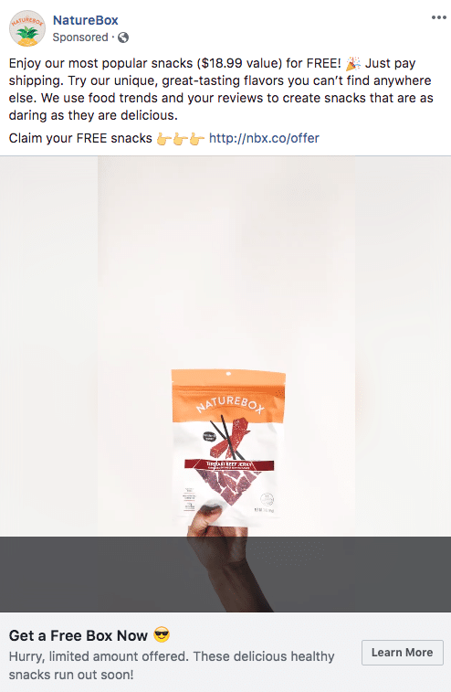
Because the ad is in the vertical format, users don’t have to rotate their mobile devices to watch it comfortably. The video’s format, as well as skilled editing, allows the product to be displayed clearly in the video. The bright orange theme, prevalent throughout the ad, is consistent with Nature Box’s brand. Viewers can’t help but feel a little happy while watching the ad.
4. Prose
Prose’s Carousel ad illustrates the power of testimonials. In the post text, Prose empathizes with women’s frustration over off-the-shelf hair care products, offering a custom experience that will solve each woman’s hair “needs and goals.” The ad is comprised of carousel cards with different testimonials and images to support the ad’s claim of addressing hair needs. One of the customers in the testimonials raves “The BEST purchase I have ever made!!!”
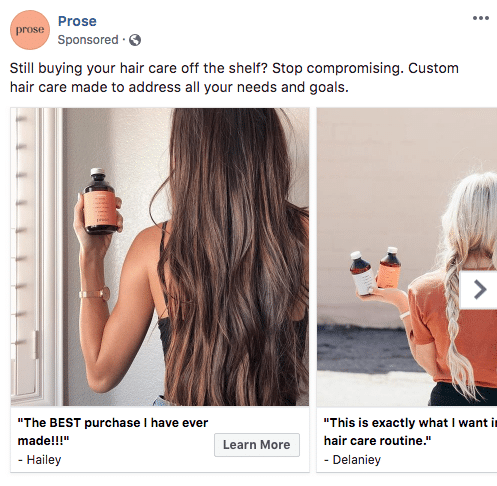
The branding in this ad is also done well, with the products featured in each image and the color scheme complementing the colors of the product labels. The photos are also high-quality, making Prose look more trustworthy. By using testimonials, consistent branding, and beautiful high-quality images, Prose appeals to every woman’s desire for gorgeous hair.
5. Madison Reed
Madison Reed’s ad educates, evokes emotion, and presents a value proposition. It educates in the post text by revealing the ingredients of Madison Reed hair colors: argan oil, keratin, and ginseng root extract. It evokes the desire for beautiful and healthy hair by using the words “nourish,” “strengthen,” “radiant,” and “multi-dimensional” in the post text and “salon-quality” in the text below the ad.
The ad also presents a value proposition by telling its audience the benefits they get when they buy from Madison Reed: beautiful, healthy, salon-quality hair and a coloring system easily done at home. The value proposition is also in the video: it features a woman getting ready to color her hair in her bathroom while her children watch from the background. The value is obvious: the hair color is easy and convenient to use. It appeals to women with hectic lifestyles, women who have limited time or money to spend two hours at a salon.
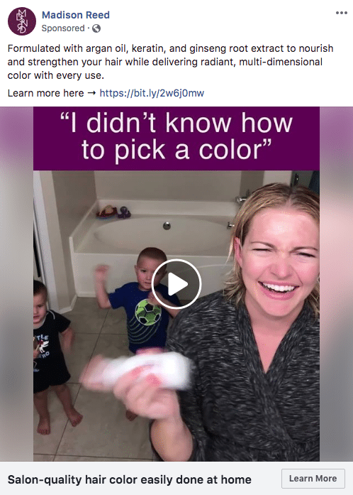
To ensure the branding is noticeable throughout, this video ad optimized for mobile contains the color purple consistent with Madison Reed’s brand and logo, making the ad pop on users’ phone screens.
6. Sand and Sky
This Sand and Sky video ad both excites and informs its audience. In the post text, the words “hype,” “addicted for life,” and “instant” get the audience excited for the face mask. It also conveys that others have used the product. By creating excitement and buzz around the face masks, the ad entices its audience to watch the video to learn more.
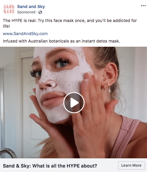
The ad also informs the audience by including a demonstration of the mask. The video shows how it works, featuring both the application and the removal of the mask. As a result, the video allows the audience to see the process from before to after. The value proposition of an instant detox mask further attracts the audience’s attention.
7. Gwynnie Bee
Gwynnie Bee uses value proposition as its primary tactic to promote its clothing subscription service. The vertical ad promotes unlimited exchanges, no due dates, all sizes, a 30-day trial, the ability to cancel anytime, and no contracts or commitments. The ad compliments these offers with a video of a model wearing the various style options the service offers.
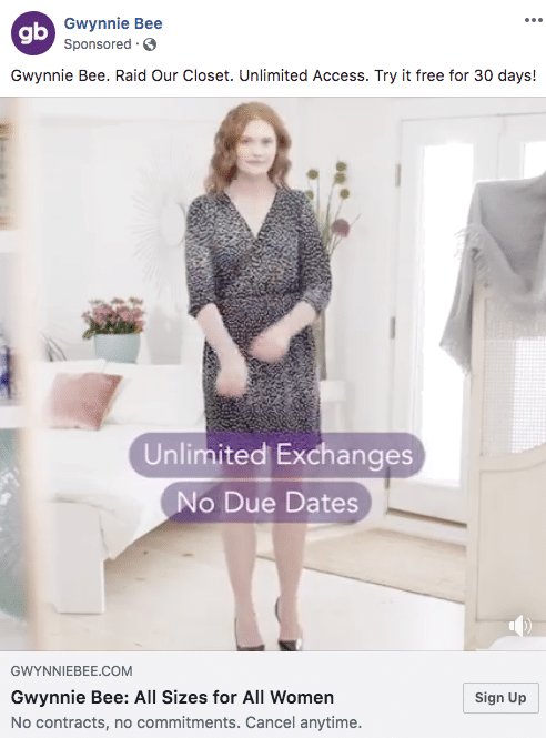
To ensure the audience will remember the brand after seeing the ad, the video consistently uses the purple color scheme to match the company’s logo.
8. Old Spice
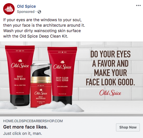
This Old Spice ad, as with most of the company’s marketing, uses humor to spice up users’ feeds. In the post text, Old Spice uses the adage “eyes are the windows to your soul” to convey the humorous idea that because the face is “the architecture around it,” it’s important to keep it clean. The text within the creative gives the humorous punch of “Do Your Eyes a Favor and Make Your Face Look Good” to urge the audience to use Old Spice to keep their faces well kempt. To top it off, the text below the image, “Get more face likes,” offers a silly yet simple value proposition. It tickles the viewer’s funny bone one last time with “Just click on it, man.”
9. Noom
Noom uses video ads like this one to educate and offer benefits to people who want to lose weight. In the post text, Noom uses the words “if you’re like 83% of Noom users ” to show the amount of current Noom users who tried to become healthy. The ad taps into the frustration people feel when finding an effective weight loss system by adding “it’s not your first time trying to get healthy.”
After creating a sense of frustration, Noom positions itself as the answer to its audience’s prayers. Within the video, large text that says “A smarter way to lose weight” appears, making the audience feel like they need to look no further. Noom reinforces this idea within the headline that says “Lose weight for good.” The clear value proposition tells viewers they no longer have to waste time with other weight loss programs.
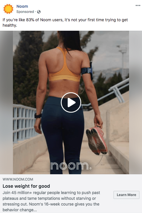
Noom pairs its rhetorical strategies with branding by featuring a woman wearing an orange sports bra that matches the orange ring in Noom’s logo.
10. Ritual
To capture the audience’s attention, Ritual creates intrigue around its product. “Ritual offers way more than traditional multivitamins do,” says the ad, suggesting that buyers will get health benefits that they can’t get elsewhere. The ad then increases interest. Using the teaser “We’re More Than a Multivitamin — Here’s Why,” Ritual compels the audience to learn more about the product. This ad gives enough information to communicate the main message (we offer more benefits than normal multivitamins) while also leaving the audience wanting to know more.
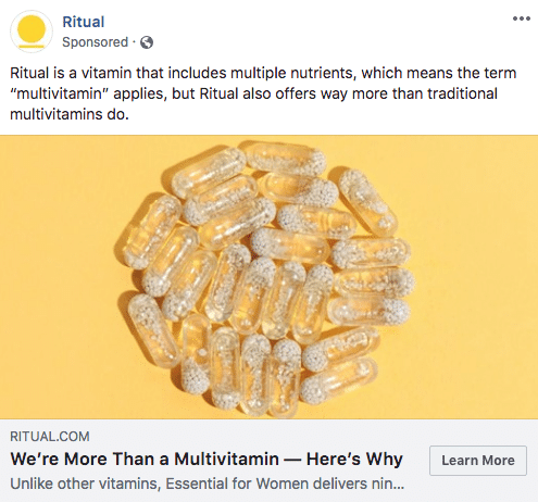
Ritual also uses the image to capture attention. The yellow background and the vitamins arranged in a circle cleverly complements the circular Ritual logo while placing the product front and center. The ad is simple yet eye-catching enough to attract users.
11. The New York Times
The New York Times markets its app in this simple yet powerful ad. The ad both evokes emotion and offers a value proposition. In very few words, the post text makes its audience feel empowered with “All your news in the palm of your hand.” The ad image offers the value proposition of “Tech in real time,” telling users they’ll get all their news instantly and conveniently from their mobile devices. The Times punctuates the message with “Stay informed” below the ad, directly next to the “Download” call to action.
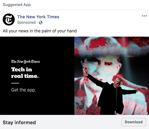
The ad reinforces branding by using the black-and-white theme of The New York Times. It flows nicely with the image to the right, which depicts a news-like story one might come across in the app.
This ad is especially effective because of its simplicity. All of the text is in short, clear sentences that demonstrate the ease, convenience, and power of the app.
12. Grove Collaborative
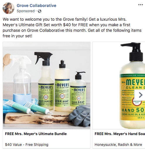
Grove Collaborative uses a Carousel ad to feature its products. The company also liberally uses the word “FREE” to entice shoppers. The images support the benefits described in the text by exhibiting the products buyers can get in their free set. Additionally, the images used in the ad are high-quality photos, making the company appear professional and trustworthy.
13. MailChimp
This MailChimp ad uses high-quality video, value proposition, and humor to drive its message. In the post text, MailChimp conveys the convenience of its marketing email automations by using the humorous comparison of a second brain. According to the ad, signing up for MailChimp is a “100% net increase in brains.” Translation? MailChimp automation is high-tech and intelligent.
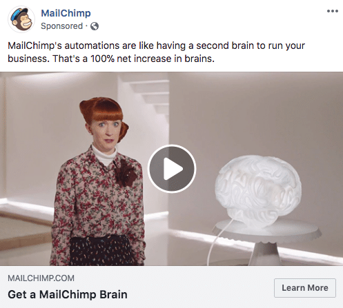
Throughout the video, MailChimp uses bright colors to contrast against the white background. The quirky woman who talks rapidly explains the concept of the “second brain,” both informing and entertaining viewers.
14. Bombas
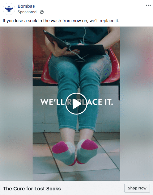
Bombas uses a common dilemma to hook its audience in this ad: a lost sock. Because nearly everyone has lost a sock in the laundry, Bombas offers to replace the socks customers lose. It even uses the headline “The Cure for Lost Socks” to appeal to those who hate losing socks.
15. Home Chef
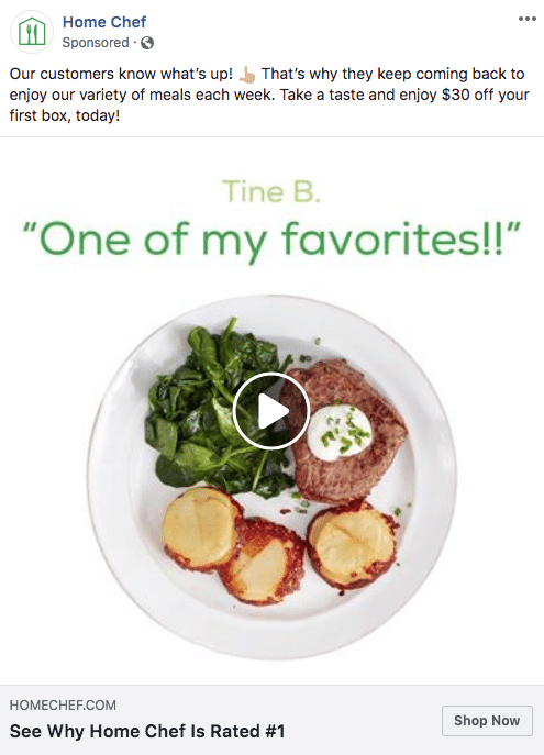
Home Chef highlights customer testimonials in this video ad to build trust and prove that the meal subscription service is rated number one. The post text also offers a discount on the first box, giving users more incentive to buy.
Throughout the video, Home Chef uses upbeat music and high-quality images of delicious food to appeal to its audience’s senses of taste and sound. The color green is also prominent, cohesively matching the green logo on the upper-left corner of the ad.
16. Lexus
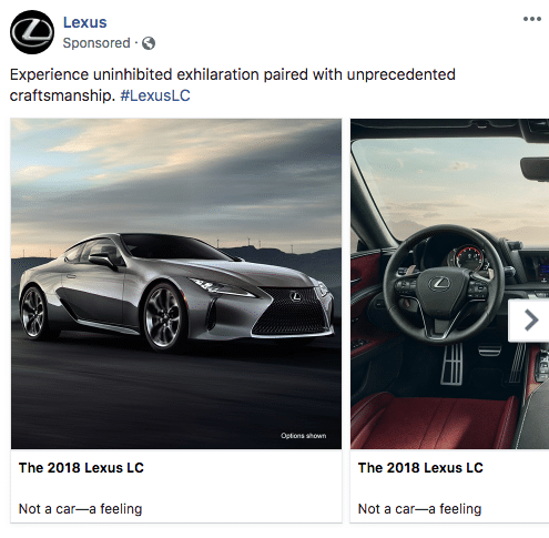
In this Carousel ad promoting the 2018 Lexus LC, the text creates a feeling of adventure and excitement by using the phrase “uninhibited exhilaration.” It then emphasizes that the Lexus LC is more than a product: “Not a car — a feeling.”
To capture attention, the ad features stunning images of the vehicle from both the exterior and the interior, using dramatic lighting and the phrase “unprecedented craftsmanship” to draw attention to quality. The ad’s color scheme, silver and black, as well as the focus on the car with the logo, highlights the Lexus brand.
17. Adobe
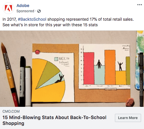
Adobe educates its audience in this back-to-school ad. Using some statistical information from last year’s back-to-school season in the post text, the ad invites the audience to access shopping data for 2018. By offering educational information, Adobe provides a benefit in exchange for customers’ clicks on the ad.
18. Coca-Cola
One can’t help but drool when looking at this Coca-Cola ad. The ad appeals to the senses, causing the audience to crave a refreshing bottle of Coke. First, the ad pairs an image of delicious steaming barbeque with a bottle of Coke to appeal to the sense of taste. Then the ad accompanies those images with chatter and clanking plates to appeal to the sense of sound. The colors are also bright, with red appearing throughout the video to match the brand logo.
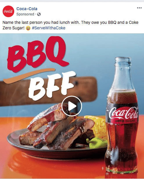
To increase engagement on the ad, it brings in a social element by playfully encouraging its audience to tag a friend in the comments section: “Name the last person you had lunch with.”
19. Squarespace
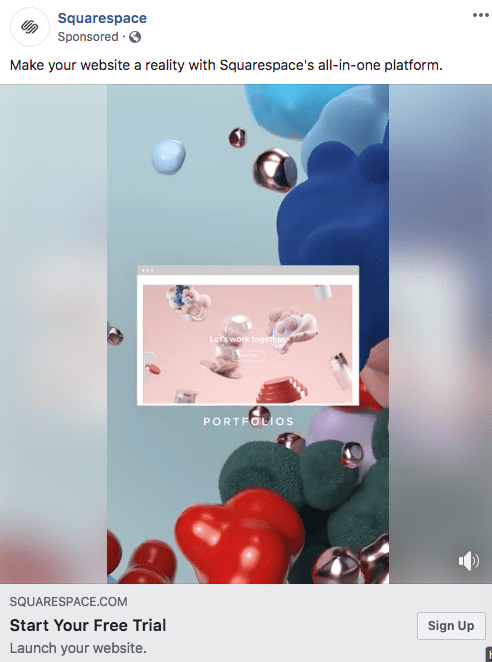
Not only is this Squarespace ad optimized for mobile screens, but it is also simple yet high-tech. First, it offers value proposition by telling its audience that they can “Make their website a reality” with the company’s “all-in-one platform” with its free trial. Second, the video uses bright colors, unique shapes, movement, and upbeat music to demonstrate different tasks that can be done through the platform. The video gets the audience excited about making their website come to life.
20. Pandora
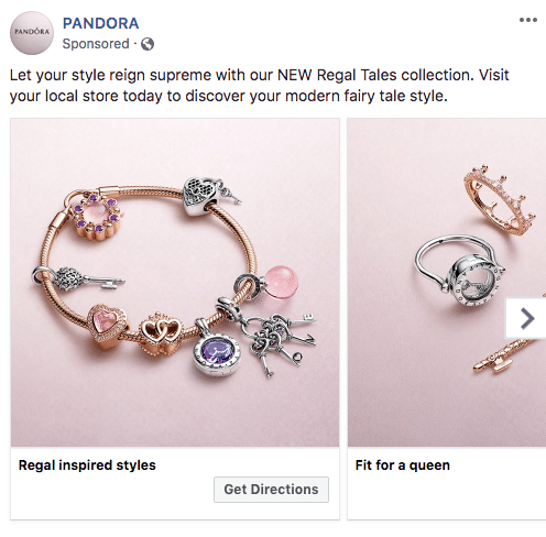
Last but not least, this Carousel ad by Pandora uses high-quality photos with bright colors to evoke emotion. Using words like “regal,” “reign,” “fairy tale,” and “queen,” this ad appeals to the inner princess of its female audience. It elicits the desire to feel pampered and pretty.
Each image features Pandora’s products against a light pink background, matching the background of the brand’s logo. In the last image of the ad, Pandora even presents a map with its location and invites the audience to “Get Directions,” driving foot traffic to physical stores.
There is no shame in looking to popular and successful brands for inspiration. Note the strategies each brand used and apply them to your own ads. If you want to use video like many of these ads, see what expert media buyers suggest in terms of Facebook video best practices. If you’re using images, make sure they’re following the recommendations for Facebook ad image size and dimensions.
