Color is one of the most powerful tools in the marketing world. But what are the best colors for branding and marketing? And how do you get your brand colors right?
Great questions!
You’ll find answers and more on this page.
The colors you choose for your brand convey emotions and communicate your personality. They also shape how consumers perceive you. According to research, the impact of color on the perception of customers is worth up to $500 million worldwide.
Selecting the right colors for your brand can:
- Boost recognition
- Inspire trust
- Spark creativity
- And most importantly, influence customer behavior
On the flip side, the wrong colors can potentially derail your branding and marketing efforts.
That’s why it’s crucial to choose colors intentionally based on color psychology and meaning. This allows you to build an influential and recognizable visual brand identity.
In this comprehensive guide, We will cover everything you need to know about choosing the best colors for branding, marketing, and beyond.
You’ll learn:
- The science behind color psychology and why it matters
- How to select a color palette that achieves your goals
- Common meanings and impressions associated with major colors
- Why colors are important in marketing
- Tips for applying colors effectively across marketing materials
- Mistakes to avoid when incorporating color in branding
Let’s dive in and explore how color can give your business a competitive edge.
Understanding the Role of Color in Branding and Marketing
Color plays a broader role in branding and marketing. Before we look at specific colors, let’s talk about why the color you use is a fundamental part of your overall brand identity.
Branding and Color
Colors are important for branding. They are a significant way that brands differentiate themselves.
Your primary brand color is the main signature shade representing your brand visually. It should reflect your brand values, spark certain emotions, and attract your target audience.
The Importance of Primary Brand Color
Every strong brand has a primary color that anchors their visual identity. This color appears prominently in the logo, website, packaging, and other branding elements.
For example:
- Tiffany & Co. – Robin egg blue
- YouTube – Red
- LinkedIn – Royal blue
A strategic primary color choice makes your brand instantly recognizable. It builds mental associations with your brand.
It helps shape your brand personality and customers’ perception of you.
When people see the color associated with your brand, they immediately think of you. That’s the power of a primary brand color.
Color Consistency Across Brand Assets
To leverage the power of your primary color, use it consistently in marketing materials, packaging, environmental branding, etc.
Maintaining color consistency strengthens your visual brand identity. It makes everything clearly identifiable as your brand.
Own Your Color in Customers’ Minds
Major brands’ color is closely linked to their brand name in consumers’ minds. The color becomes almost synonymous with the brand.
Think UPS brown, Tiffany’s robin egg blue, or Coca-Cola red. The color is part of their brand identity.
Owning a color this way can provide your brand instant recognition and memorability. But it requires rigorously building those associations over time through color consistency across all brand touchpoints.
Color Psychology
Beyond branding, understanding the psychology of color allows you to use color strategically in marketing.
Different colors elicit different psychological reactions and emotions in people. Marketing materials that leverage these reactions can attract, engage, and influence customers better.
Colors Evoke Emotions
Research shows colors directly impact moods and emotions. The feelings triggered cause physical changes – increased appetite when seeing red or elevated blood pressure when seeing orange.
Here are some examples of emotional reactions tied to colors:
- Red – Energy, excitement, passion
- Yellow – Happiness, optimism, cheerfulness
- Green – Peace, health, tranquility
- Blue – Trust, professionalism, calmness
Skillfully incorporating colors allows you to steer customers toward desired mindsets and actions.
Colors Communicate Brand Personality
Colors also shape brand personality – serious, playful, elegant, cutting edge, etc.
For example, neon or bright colors make a fun, youthful brand personality. Dark or muted colors make a refined and formal personality.
Choose a color that aligns with the personality you want to convey. This simple act builds an emotional connection with your target audience.
Color Theory and Schemes
Understanding basic color theory also helps in choosing your brand colors.
The Color Wheel
The color wheel displays how colors relate to each other. It’s used to create color schemes.
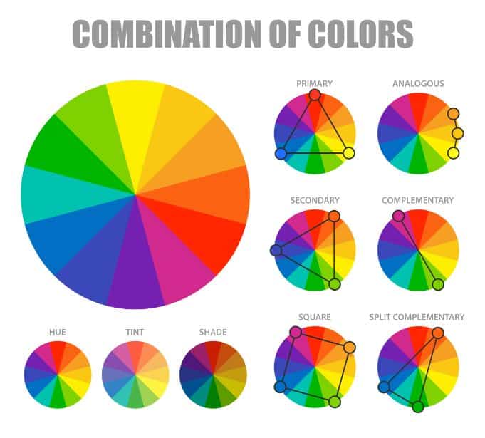
These are some key points about the color wheel:
- Primary colors – Red, yellow, and blue
- Secondary colors – Green, orange, purple
- Complementary colors – Colors opposite each other on the wheel (red/green, blue/orange)
- Warm colors – Red, orange, yellow
- Cool colors – Green, blue, purple
Types of Color Schemes
Using the color wheel, you can create color schemes to use in branding and marketing.
Here are some popular options:
- Monochromatic – Shades of one color
- Analogous – Colors sitting by each other on the wheel
- Complementary – These colors are opposite on the wheel
- Triadic – Colors evenly spaced on the wheel
Different schemes evoke different reactions. Monochromatic conveys uniformity, analogous harmony, and complementary contrast.
Choosing the Right Colors for Your Brand Identity
Now let’s explore how to strategically choose colors to strengthen your brand identity and boost marketing.
Importance of Color in Marketing
Color isn’t just for logos and branding. It’s also crucial for marketing materials.
Increasing Brand Recognition
Using your brand color consistently in marketing makes it easier for people to recognize your brand. They start associating that color with you.
Grabbing Customer Attention
Color incites reactions that grab attention amidst clutter. Contrasting colors, in particular, make your marketing content stand out.
Conveying Message and Meaning
Color enhances meaning and shapes how viewers interpret marketing messages.
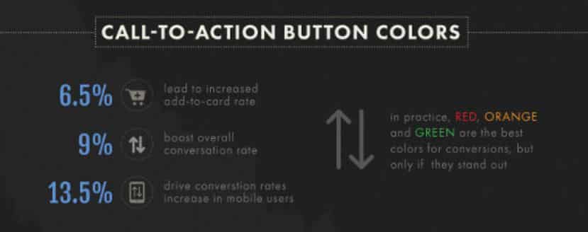
For example, red conveys urgency in CTAs, and black signals prestige in premium offerings.
Directing the Customer Journey
Strategic use of color can guide visitors along conversion funnels toward desired actions.
For instance, green can indicate “go” for desired behaviors. Red can highlight danger or losses in opt-out messaging.
When used intentionally, color becomes an influential tool in your marketing arsenal.
Building a Brand Identity
A core part of brand identity is the color palette. This includes primary, secondary, and accent colors.
Primary Brand Color
As discussed earlier, this is the main color representing your brand visually. It should appear widely in your branding and marketing materials.
Secondary Colors
These are complementary colors that play a supporting role. Usually, 2-3 secondary hues contrast well with your primary color.
Accent Colors
Accents are pops of color for highlights, calls to action, and interactive elements. They add flair when used sparingly.
Aim for a cohesive brand palette. Secondary and accent colors should complement your primary color, not compete with it.
The Psychology of Color in Marketing
Colors have symbolic associations, cultural meanings, and emotional undertones. Leveraging these can boost your marketing.
Here are some of the most impactful color meanings to consider:
Red
- Passion, excitement, intensity
- Boldness, speed, impulsiveness
- Love, heat, aggression
- Danger, caution, stop
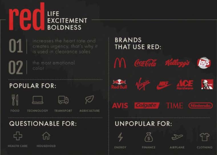
Red attracts attention and incites reactions. Use it to energize and excite.
Orange
- Fun, Ambition, playful
- Affordable, whimsical, informal
- Attention-grabbing, Confidence, low cost
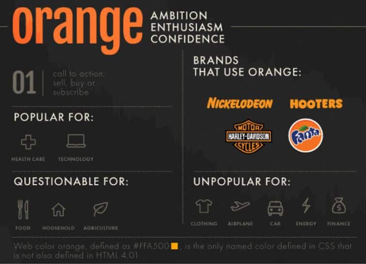
Orange is a color that conveys affordability and friendliness. Use it to appear casual, approachable, and youthful.
Yellow
- Joy, warmth, optimism
- Caution, warning, slow down
- Energy, freshness, lemons/sunshine
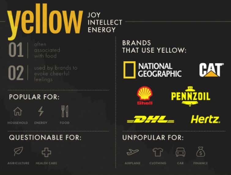
Cheerful yellow puts people in an upbeat mood. But it also signals caution. Use both associations cleverly in marketing.
Green
- Nature, health, renewal
- Peace, harmony, balance
- Money, wealth, Growth
- Go, permission, safety
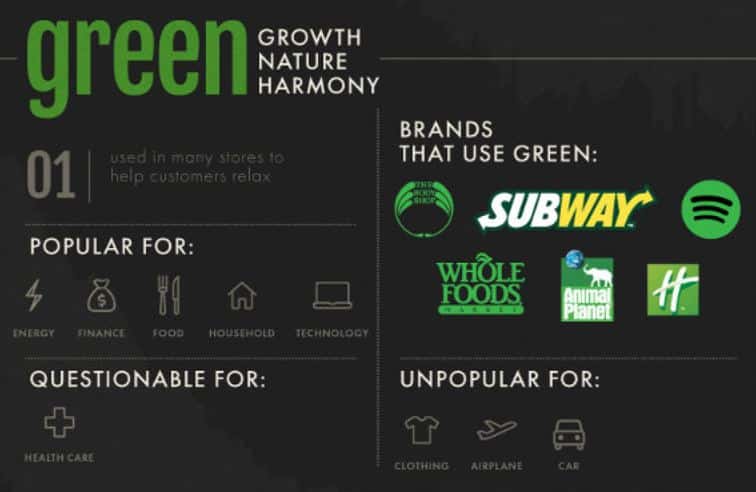
Green has many positive connotations, like nature, renewal, and giving permission. Leverage these in your messaging.
Blue
- Stability, professionalism, productivity
- Trust, credibility, confidence, calm
- Cleanliness, peace, order, coldness
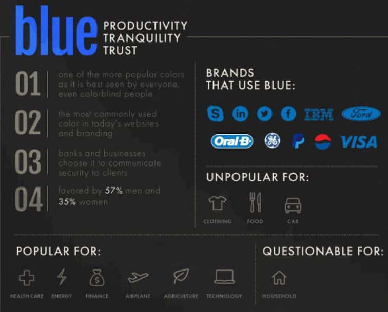
Blue signals credibility and stability. It instills confidence and trust. Use it to appear professional.
Purple
- Royalty, luxury, power
- Mystery, spirituality, imagination
- Nostalgia, sentimentality, romanticism
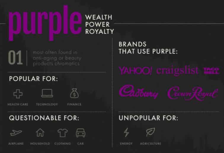
Purple is the color of luxury and royalty. It also stimulates the imagination. Leverage these associations in your messaging.
Black
- Power, sophistication, elegance
- Edginess, mystery, sexiness
- Death, evil, heaviness
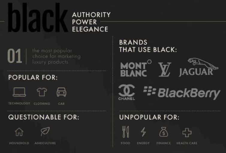
Leverage black’s association with sophistication. But beware of potential negative connotations like death and evil.
White
- Purity, clarity, cleanliness
- Simplicity, peace, calmness
- Sterility, emptiness, isolation
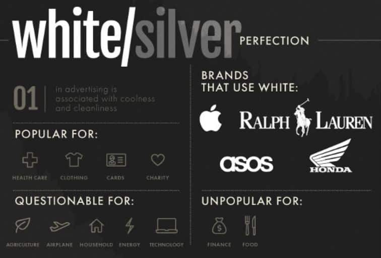
White is a popular color for cleanliness and purity. But in excess, it also suggests emptiness. Use white space thoughtfully.
There are many more specific color meanings to consider when incorporating hues into your brand identity and marketing. But these cover some of the most prominent associations. The best colors to use should represent what you want people to think whenever they hear about your company.
How to Use Color in Marketing
Now let’s get into practical tips and strategies for applying color effectively in your marketing.
Building a Brand
Here are some smart ways to use color while building your brand.
Reflect Your Brand Values and Personality
As mentioned earlier, choose colors that reflect the personality you want your brand to project.
Cool blues and greens convey stability and nature. Warm reds and oranges express energy and casualness. Pick what fits you best.
Consider Competitor Colors
Analyze competitors’ choices of color while selecting your palette. You want your color identity to stand apart in the marketplace.
Leverage Cultural Meanings and Symbolism
Use colors to connect with cultural associations and meanings. Red and yellow in Mexican restaurants, green in Irish pubs, etc.
Be Consistent
Stick firmly to your primary and secondary colors. Consistency builds recognition and ownership of those colors.
Allow for Future Pivots
While consistent, small tweaks keep your palette fresh. Don’t box yourself in completely. Give room to evolve the color scheme along with your brand.
Adhering to those core principles will help you build a distinctive, recognizable brand with color.
Using Color in Marketing Materials
Here are some tips for applying color specifically to marketing deliverables:
Logo Design
Make sure your logo pops by using your primary brand color prominently. Contrast it with white space or complementary colors.
Website Design
Website color schemes are a huge opportunity to reinforce your brand identity. Use colors consistently across pages.
Social Media
Maintain brand color consistency across social media platforms. Also, leverage colors to highlight key actions like your call-to-action buttons.
Print Materials
Use brand colors in business cards, letterheads, brochures, flyers, and other print materials. This drives home recognition.
Packaging
Incorporate your brand color scheme on all product packaging. Consistent colors make products identifiable on shelves.
Advertisements
For print, TV, online, and outdoor ads, rely heavily on brand colors for instant recognition amidst clutter.
Promotional Items
Put your colors on t-shirts, pens, mugs, and other swag. Make your brand hue impossible to escape.
Using your colors widely cements them in customers’ minds and builds familiarity with your company.
Color in Marketing Campaigns
Here are some powerful ways to use color in specific marketing campaigns:
Capture Attention with Contrast
Use contrasting accent colors that pop against your main palette. Contrast grabs the viewer’s attention in busy environments.
Direct Focus with Color –
Use color to guide the viewer’s eye toward key items like your call-to-action button.
Establish Visual Hierarchy
Make important elements like headlines darker/brighter so they stand out first. Use color to create a visual hierarchy.
Convey Meaning
Leverage color associations your audience recognizes. Green for organic products, blue for professional services, etc.
Inspire Action Through Color Psychology
Trigger reactions with the color choice – red to convey urgency in CTAs, black for elegance in high-end offers.
Reinforce Messaging
Use color to emphasize key messaging. Green in messaging about conservation values or blue for trustworthiness.
Purposefully incorporating color amplifies the power of your marketing campaigns.
Some Common Mistakes Businesses Make When Choosing Brand Colors
While powerful when used intentionally, color can also hurt your brand if not done thoughtfully. Here are mistakes to avoid:
Not Considering Color Meanings
Each color conveys different meanings. Be sure to consider the impression and emotions triggered by colors before incorporating them into your brand identity.
Avoiding Trends Without Purpose
Don’t choose trendy colors without reason. But don’t avoid them if they genuinely suit your brand personality and goals. Picking the right color combination is key.
Conflicting with Industry Norms
Be aware of typical color associations in your industry. Either align or intentionally contrast with them based on your positioning.
Choosing Too Many Colors
Restrict yourself to 2 – 4 colors max. Too many colors dilute brand recognition and seem chaotic.
Insufficient Contrast
Ensure colors contrast well, especially text and background. Insufficient contrast causes readability issues.
Forgetting Color Consistency
Using colors inconsistently across branding and marketing materials confuses your visual identity. Maintain consistency.
Copying Competitors
Don’t copy competitors’ color schemes. Having similar colors undermines differentiation.
With some vigilance, you can avoid mistakes and use color strategically.
Companies that Updated their Logo Colors
Creative Cloud: In 2020, Adobe changed the Creative Cloud logo from its signature red to a rainbow gradient. This transformation represents all the different Creative Cloud products under a single umbrella.
Burger King: In 2021, Burger King underwent its first rebrand in over 20 years. The new design included a modified adaptation of the 1969 and 1994 logos, featuring a bold red wordmark sandwiched between two bun halves. The blue color was completely dropped from the logo.
Google Ads: In 2018, Google Adwords changed its name to Google Ads and introduced a new logo that went with Google’s full suite of advertising solutions. The logo features a bold use of color to tell the audience that there are many solutions.
These color changes demonstrate that companies always want to refresh their image and stay current with design trends.
Key Takeaways
Here are some key points to remember:
- Color is central to branding and recognition. Use a primary brand color widely for consistency.
- Different colors trigger psychological and emotional reactions. Leverage them.
- Build a complementary palette with secondary and accent colors.
- Use colors that reflect your brand personality and industry associations.
- Be consistent across branding and marketing materials.
- Avoid common color mistakes like lack of contrast or excessive variety.
Conclusion
Color is an extremely influential yet often overlooked factor in marketing and branding. It shapes recognition, associations, emotions, and ultimately behaviors.
This makes thoughtful use of color essential for companies wanting to build memorable brands. You can develop a strategic color palette. Considering color psychology, meanings, and industry norms is key.
Consistent application of your color scheme deepens your brand identity. So, be intentional with every color choice. Experiment to find what best fits your brand personality and goals.
Use this guide to unlock the full power of color in your branding and marketing.
Once you nail down your brand colors, paid ads are a great next step to take. AdvertiseMint can put your products or services in front of more of your target audience.
Let’s help you create high-converting ad campaigns. We know our stuff when it comes to driving results through strategic paid ads.
Want to learn how we can amplify your brand through targeted marketing?
Click here to request a free Google ads consultation with one of our ads experts.