
Creating display ads that effectively grab attention and drive conversions on the Google Display Network can be tricky.
We’ve all seen those blocky, boring banners that blend into the background. How do you make your ad stand out from the sea of mediocrity?
The solution lies in understanding what makes a great display ad “clickable.” And the best way to get that understanding is to study successful display ad examples.
In this article, I’ve put together 33 finger clicking good display ad examples across industries to inspire your next campaign. You’ll also learn the key elements of high-performing display ads.
Whether you’re new to display advertising or looking to refresh your creatives, the 33 eye-catching examples can help put you on the right path. And boost your return on ad spend (ROAS) significantly.
Without further ado, let’s dive in and get you inspired!
What Are the Key Elements of High-Performing Display Ads?
So you want to create a display ad that grabs attention, drives clicks, and boosts your conversion rate? In promoting products and services, the key is to include these crucial elements below in your display ads:
A Striking Visual
Your ad creative needs to shine brighter than the content around it. You should use:
- 📸 High-quality, relevant images or illustrations that pop
- 🎥 Short, eye-catching video if budget allows
- 🎨 Vibrant colors and visual contrast
Aim for visuals that amplify your message and fit seamlessly into the surrounding content.
A Clear Value Proposition
Spell out how your product or service solves your target audience’s needs simply and effectively.
- 🎯 Outline the key benefits you provide
- 😃 Use friendly, conversational language
A Solid CTA Button
Don’t leave visitors guessing what to do next! Guide them with a clear call to action like “Shop Now” or “Learn More.”
- ✅ Use action-driven language
- 🖱️ Make sure the button looks clickable
Follow these guidelines, and your display ads will be primed for clicks and conversions!
Now, let’s check out 33 remarkable display ad examples and why they work. From striking imagery to value propositions that resonate, these creatives check the right boxes as a key component of successful digital marketing campaigns.
As you browse, take note of tactics you can mimic to make your own ads more clickable. Steal ideas shamelessly – great artists borrow; truly great ones steal! 😉
#1 Display Ad Example: Gusto

Gusto provides a stat showing users are highly satisfied after using its software. The HR software provider claims to cut payroll time spent by half for companies and that customers speak highly of them.
The value proposition is straightforward – Gusto users stay happy. Gusto follows up with an appealing free trial call to action.
Gusto keeps its message simple and benefit-focused rather than branding-focused. The proposed value and trial ideas interest the target audience enough to try the software for themselves.
#2 Display Ad Example: Lumbar Liquidators

Lumber Liquidators used a great strategy here. They offer people the chance to preview renovations via an app.
It’s smart to make the app visualization the focus of the display ad.
People contemplating big renovations would want to preview the outcomes before engaging the company’s services. That attracts them to try the app, as the CTA button says.
#3 Display Ad Example: The Ridge
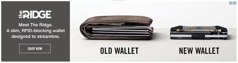
Big leather wallets strain backs and expose chip cards. This slim wallet that promises to boost safety with its RFID-blocking feature would appeal to many men who value safety and comfort.
The ad visually shows the wallet’s edge over a typical bulky one. A clear comparison in a display ad is one of the best ways to demonstrate the superior qualities of a product.
Viewers see the appealing difference and hit the ‘Shop Now’ button to order the slim wallet to replace their bulky ones.
#4 Display Ad Example: Santander
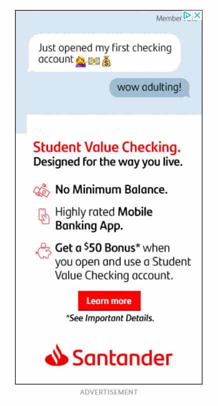
Santander used the ad space well without overcrowding it. The text chat draws youth, and the fancy bullet points clearly state the benefits for students – the target users.
The concise value checking account details would also appeal to the student group and get their clicks.
#5 Display Ad Example: PayPal

PayPal pitches premium business solutions as refreshingly simple. This motivates upgrades for current users and switches from rival services.
Familiar branding and colors attract eyes and encourage viewers to click through.
#6 Display Ad Example: Nike
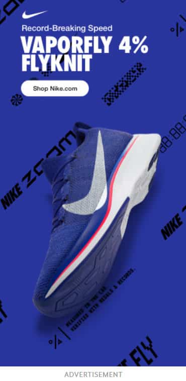
Nike display ads effectively showcase products visually while spotlighting unique features. For some items, this format lets the product’s physical qualities take center stage, supported by concise captions.
For this ad, minimal text works best for reaching the target users. The right product image speaks volumes.
#7 Display Ad Example: Chevy
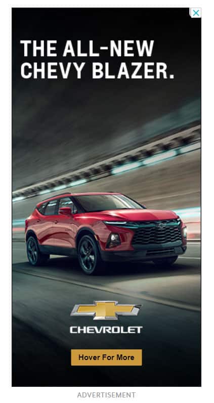
A straightforward ad copy can still connect strongly. This vehicle ad proves that – clean design with minimal text yet still intriguing. The call to action button’s hover feature deepens engagement, revealing more details interactively.
It attracts interest despite blank space and sparse wording. With some offerings, less truly is more if key selling points come across quickly. This gets the balance right between impactful and concise.
#8 Display Ad Example: Express Clothing
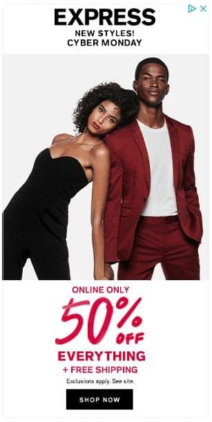
The hero image shows some available clothing styles, with the ad promising new fashions. The Cyber Monday heading captures eyeballs by touting steep savings for the holidays.
It’s hard to scroll past such an enticing deal. The value proposition compels clicking for a closer peek.
Online shoppers will want to check out the offering, even if only out of curiosity. Overall, this effective display ad checks the right boxes:
- Illustrated product design.
- A timely promotion for significant sales.
- Savings are framed as too good to pass up without investigating.
#9 Display Ad Example: Sherwin Williams
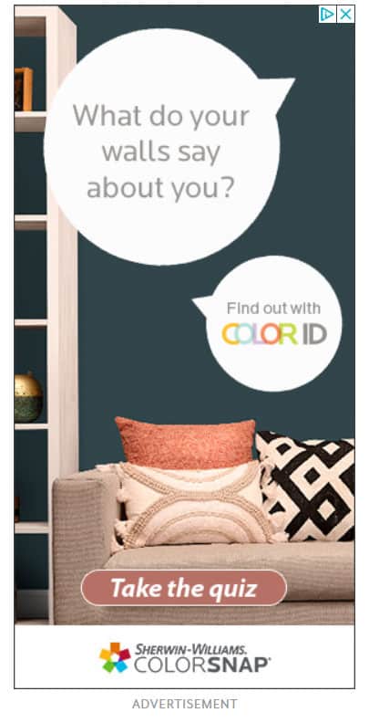
Sherwin Williams taps into customization cravings with a personalized call-to-action. Their CTA button leads to a quiz handing users their unique ‘Color ID.’
This is far more intriguing than a generic ‘Shop Now.’ The interactive angle draws on the digital-age desire for things specially tailored to an individual. This novelty should outperform the regular e-commerce CTA text in clicks and conversions.
#10 Display Ad Example: Disney +
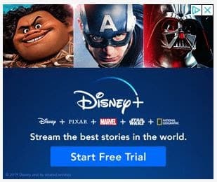
Disney+ entered an intense streaming competition but held prime content advantages with world-class stories to share.
They showcase a solid value proposition upfront. Then, the call to action tempts viewers to try their new streaming platform for free.
Owning timeless and beloved tales helps Disney+ to draw massive clicks. The ad is a great example of how to leverage brand trust.
#11 Display Ad Example: WayFair
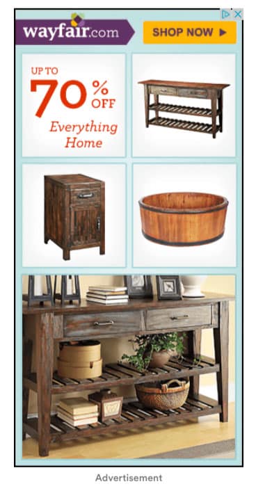
Wayfair’s display ad gets quickly to the point. It pushes shoppers directly to Wayfair.com via its discount offer and noticeable “Shop Now” button.
This hard-to-miss Call to Action keeps Wayfair top of mind and prioritized for browsers eager to save big on household items.
#12 Display Ad Example: SunTrust

SunTrust’s limited-time student loan offer suits the constraints of display advertising.
Rather than cram details into small spaces, an attractive smile from a young woman and a clear call-to-action drive site traffic for more information.
The nature of special deals with looming deadlines demands concise hooks. This creative directs focus onto easy next steps with minimal distractions.
#13 Display Ad Example: Shopify

As an e-commerce leader, Shopify simplifies website creation, which fuels its dominance. Yet it provides far more – a full suite of sales tools vital for online entrepreneurs.
This ad spotlights those capabilities upfront while encouraging clicks with a free trial offer. For retail businesses desiring expansion online, the value proposition speaks volumes – effortless sites and selling infrastructure to convert.
#14 Display Ad Example: Cadillac
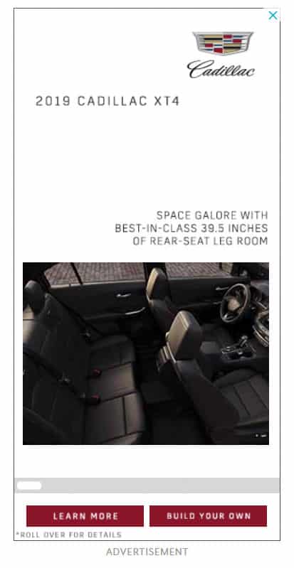
True to Cadillac’s signature luxury, the ad shows convenience for high-end lifestyles.
It captures the brand’s aesthetic, and the two different calls to action boost further engagement.
#15 Display Ad Example: Chase

Chase’s ad highlights a $200 bonus plus no yearly fees. This appeals to most credit card users.
The Freedom Unlimited card name implies open-ended possibilities. Viewers quickly grasp key perks before clicking to learn more. Simple but compelling, it spotlights incentives without overloading.
The CTA button pops in green, signaling viewers can freely explore. It packs lots of motivation to click by targeting diverse needs yet maintains straight-to-the-point clarity on card advantages.
#16 Display Ad Example: Zillow
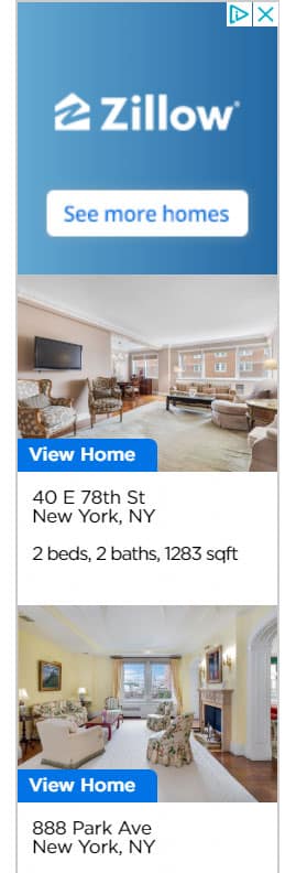
Zillow spotlights home listings for serious buyers. The ad previews two different listed apartments. This is a good use of limited ad space to sell the opportunity.
The visually-driven approach speaks to committed home shoppers ready to explore specifics through clicking.
#17 Display Ad Example: Audible

Many people now love audiobooks. Audible lets book fans listen to the content of their favorite books. The audiobook and podcast service gives three audiobooks each month. In this ad, new users are immediately offered a discount.
The goal is to get more listeners hooked on everything Audible provides. When you can dive into so many spoken stories, it’s easy to get caught up in playing more. Audible banks on that appeal.
The ad’s visual draws instant interest by featuring a bestselling book readers already crave to enjoy.
#18 Display Ad Example: GMC
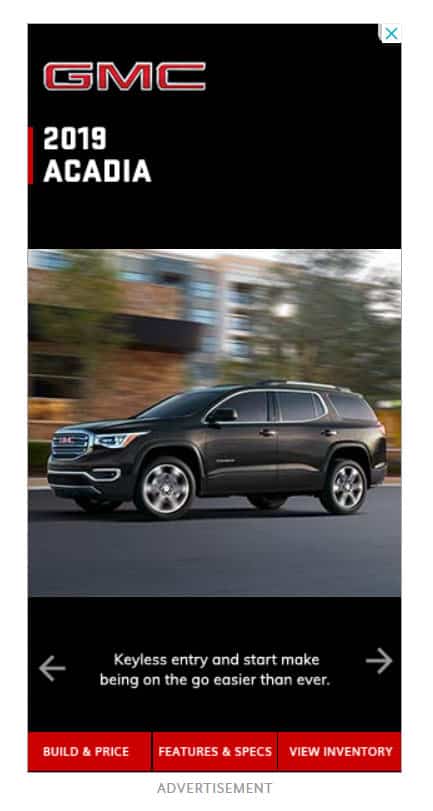
This auto ad works well for two big reasons. One – it shows off a nice vehicle feature many people would want. Two – it includes more than one call to action button to pick from.
Highlighting a top desired product feature and then giving website visitors options on the next steps is smart. Having choices on what to click on makes customers feel in charge.
This winning combo turns initial curiosity into deeper commitment. The ad speaks right to preferences and gives control. More people will connect with its message this way, meaning better ad results.
#19 Display Ad Example: MailChimp

MailChimp started by focusing solely on email campaigns. But now, their tools help marketers do much more. This ad design tells us two key things.
One – It tells you about MailChimp’s new product. Two – the company aims to boost customer businesses.
The branding elements, like colors and logos, match what we expect from MailChimp. The main CTA button pops from the other text cleanly. There are no confusing extra designs to distract from signing up.
#20 Display Ad Example: Birch Lane
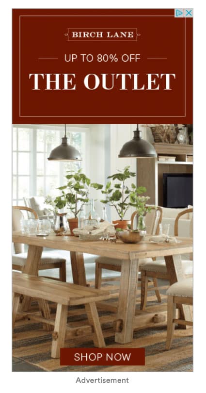
Birch Lane’s ad uses a good quality photo and big savings discounts to draw clicks. The call to action stands out as well. With Google display ads, you must make strong impressions quickly.
Viewers barely glance before moving on. So quality pictures, big deals in dollars off, and hard-to-miss buttons to click work well for this ad. Together, this triad makes this ad click.
#21 Display Ad Example: Etrade

Etrade’s ad speaks directly to a top issue for online investing apps. Many people feel alone trying to pick financial assets and trade through their phones. Doing enough research seems really hard and lonely.
So right away, Etrade says – let’s join together on this instead. We’ll invest along with you. Their focus on not leaving you to figure investing out by yourself makes their service stand out.
Addressing that major pain point head-on gives a big value promise upfront. It provides a sense of togetherness that is lacking in other finance apps.
This ad also uses green thoughtfully. Green can signal money and wealth. Here, the green is softened with some blue for stability. That creates a mood of being refreshing yet secure.
#22 Display Ad Example: Wells Fargo
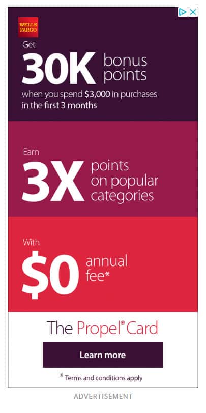
This credit card ad by Wells Fargo uses attractive numbers and bold benefits to hook in potential customers. Specifics like 30,000 bonus points grab notice fast.
Calling out perks like no annual fees also wins attention. People tend to buzz over digits that signify big wins or savings.
#23 Display Ad Example: Brita
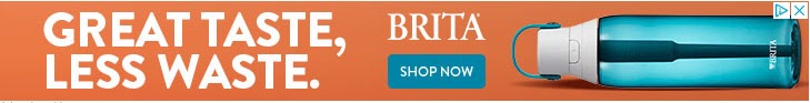
Lots of plastic water bottles get trashed annually. Brita seeks to change that. Their filtered bottle looks slick and simple in the banner ad.
It gives an assurance of the same Brita water quality without waste. Reusable containers now seem standard, not special. But Brita’s CTA seems to be promising to quench each person’s thirst with a purified refreshment.
Here are a few key notes on Brita’s ad:
First, their value promise connects to cutting waste. Many people support that cause.
Second, they picked a bottle color that matched clean, tasty filtered water. This clear blue-green evokes crisp purity you’d gulp down. Choosing an exact color echoing their top product benefit is brilliant.
#24 Display Ad Example: ActiveCampaign
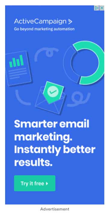
ActiveCampaign’s ad targets results-focused marketers. So, highlighting better marketing automation catches their eye quickly.
Offering a free trial seals the deal even more to draw clicks. The ad plays to the core priorities of achieving more with smarter effort.
#25 Display Ad Example: Amazon

Low wages are among the top pain points some employees in the retail e-commerce industry face. While Amazon pays higher than the national average, this hiring ad speaks directly to money worry.
The Call to Action also does a great job. It gently invites interested individuals to join the Amazon team. This hints at a friendly, supportive workplace.
#26 Display Ad Example: Constant Contact
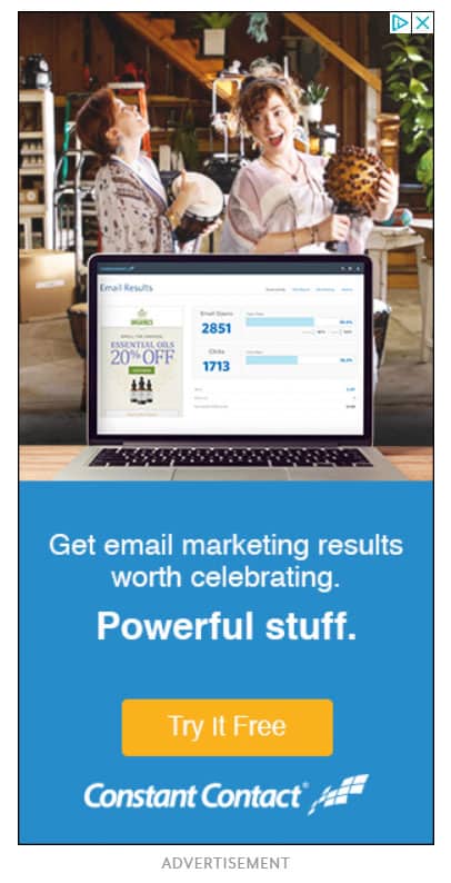
Constant Contact uses a casual, conversational voice in this ad. The relaxed tone keeps things simple and makes the ad stand out.
Offering a free test run of its email marketing software also hooks readers. The no-commitment trial sign-up incentivizes clicking through.
#27 Display Ad Example: Staples
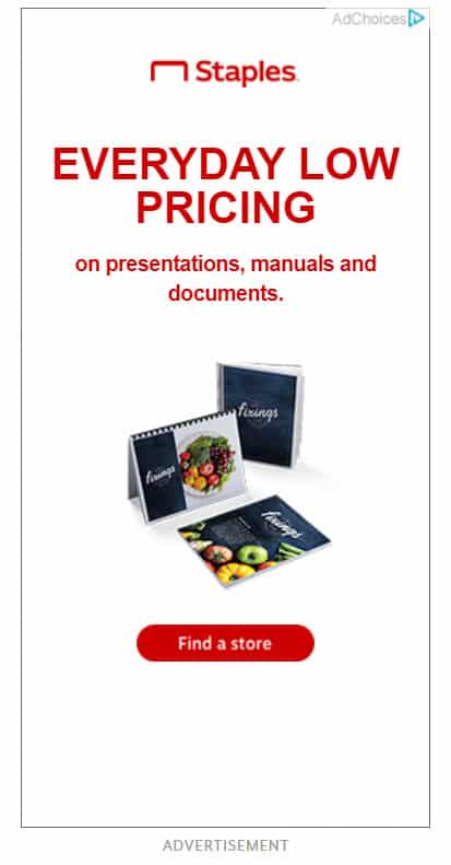
This display ad from Staples aims to highlight low prices and drive more shoppers through their doors. Using a call to action that says, ‘Find a store,’ works great in boosting store visits.
Keeping text minimal lets the low pricing detail stand out to draw in value-hungry eyes.
#28 Display Ad Example: Nivea
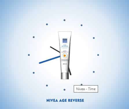
Nivea’s ad keeps things simple yet uses imagery well. Their age reverse cream boldly promises to reverse aging.
Smartly showing the actual product image on top of a clock illustration drives the promise home further.
This creative display ad grabs eyes by spotlighting the Nivea brand, the product, and its anti-aging benefits. That’s a winning promotional combination executed smoothly.
#29 Display Ad Example: Vista Print
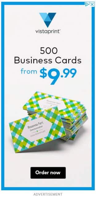
This ad shows how brands can succeed by providing consistent, excellent service and value.
Vista Print offered 500 business cards at a low cost. Earning repeat business for expanded printing needs is the business goal. They built their business through this model.
This ad uses a clean, simple look, sticking to the basics. It highlights low card rates and makes it easy to place orders with a bold CTA button.
Vista Print continues playing to its proven strength while upholding quality. It’s smart to leverage what works.
#30 Display Ad Example: Nintendo

Nintendo used a sharp visual display ad with concise text to convey its message.
The central part of the ad focuses on the product. That gives the simple but powerful tagline breathing room to speak to video game enthusiasts precisely. The ad size and the vibrant red color are key in drawing attention.
#31 Display Ad Example: Air France
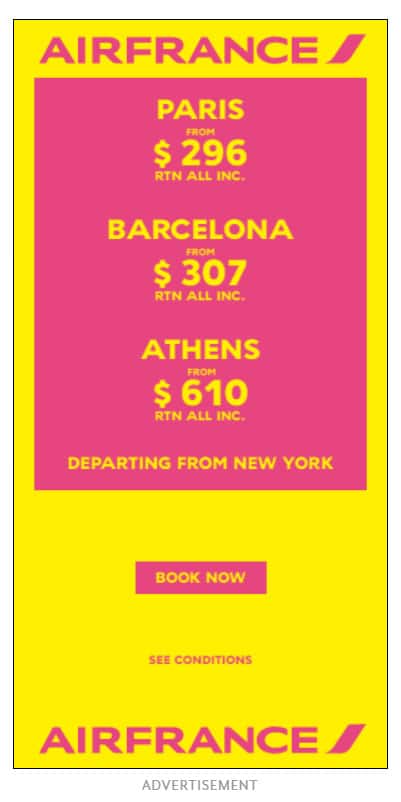
Bright colors plus bargain rates grab eyes in this display ad by Air France. The ‘Book Now’ call to action button works great to close the sale.
Both factors work together to convert page impressions into customer commitments.
#32 Display Ad Example: PODS
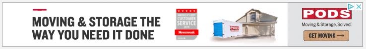
This ad by PODS speaks directly to moving and storage headaches for families. The moving and storage company puts its solution forward fast – move and store household items on your own terms.
That would strongly appeal to many who dread the stress involved in those activities. Clicking the ‘Get Moving’ CTA button to engage the services of PODS would follow next.
#33 Display Ad Example: ChordBuddy

ChordBuddy displays the logos of popular media companies and channels that have featured them.
The brand logos build trust and give site visitors that extra motivation to click through. The goal is to lead viewers to buy their guitar learning system and kits.
Tapping into their association with recognizable media brands like Forbes, ABC, and MSNBC works magic. It makes ChordBuddy seem credible and monitored by brands we know. A great use of social proof in a display ad!
Conclusion
That wraps up our tour of some finger-lickin’ good display ads in the online advertising landscape. As you saw, with some creativity and strategic thinking, your display ads can do two things – stop fingers from scrolling and get the clicks flying in.
The display ad examples we covered show the power of having an intriguing image, compelling ad copy, or bold text to draw eyes in.
Whether you make viewers laugh, gasp, or tilt their heads, unique and welcoming ads invite engagement. And without being pushy or misleading. Simply put – make ads people want to click.
Study these examples for inspiration as you craft your next display ad campaign. See what interesting layouts, emotional appeals, or unique value propositions connect with users.
Test different images, colors, and ad sizes too. And don’t forget to follow best practices for 2023 or whatever year you read this article. Things change fast with Google Ads and other online advertising channels.
If you need help reaching your target audience with display ads, AdvertiseMint can help!
With our paid social media ads services, we can put your products or services right on the faces of people who need them. Yes, our ads experts are that good!
Want to leverage our advertising services to scale your business?
Then partner with us right away! You can get started by having a consultation with one of our ads experts.
Click here to request your FREE Facebook ad consultation now!